Project Overview
Odreim is an independent Hong Kong beauty brand that embraces authentic and practical skincare rituals. Their philosophy centers on creating professional, science-based products that help users achieve healthier, more radiant skin. By rejecting superficial beauty ideals, Odreim focuses on trustworthiness and efficacy through well-researched, effective ingredients.
As the designer for this project, I was responsible for building the brand identity from the ground up — from logo creation to packaging design. The process was both challenging and creatively stimulating, offering a chance to translate the brand’s values into a visual language that feels honest and inspiring.
ODRIEM
DELIVERIES | BRANDING - LOGO - PACKAGING DESIGN - PRINTING
The Challenge
I began developing the visual identity before the physical products were launched. The main challenge was to define a clear brand image that would resonate with the target audience and stand out in a competitive market.
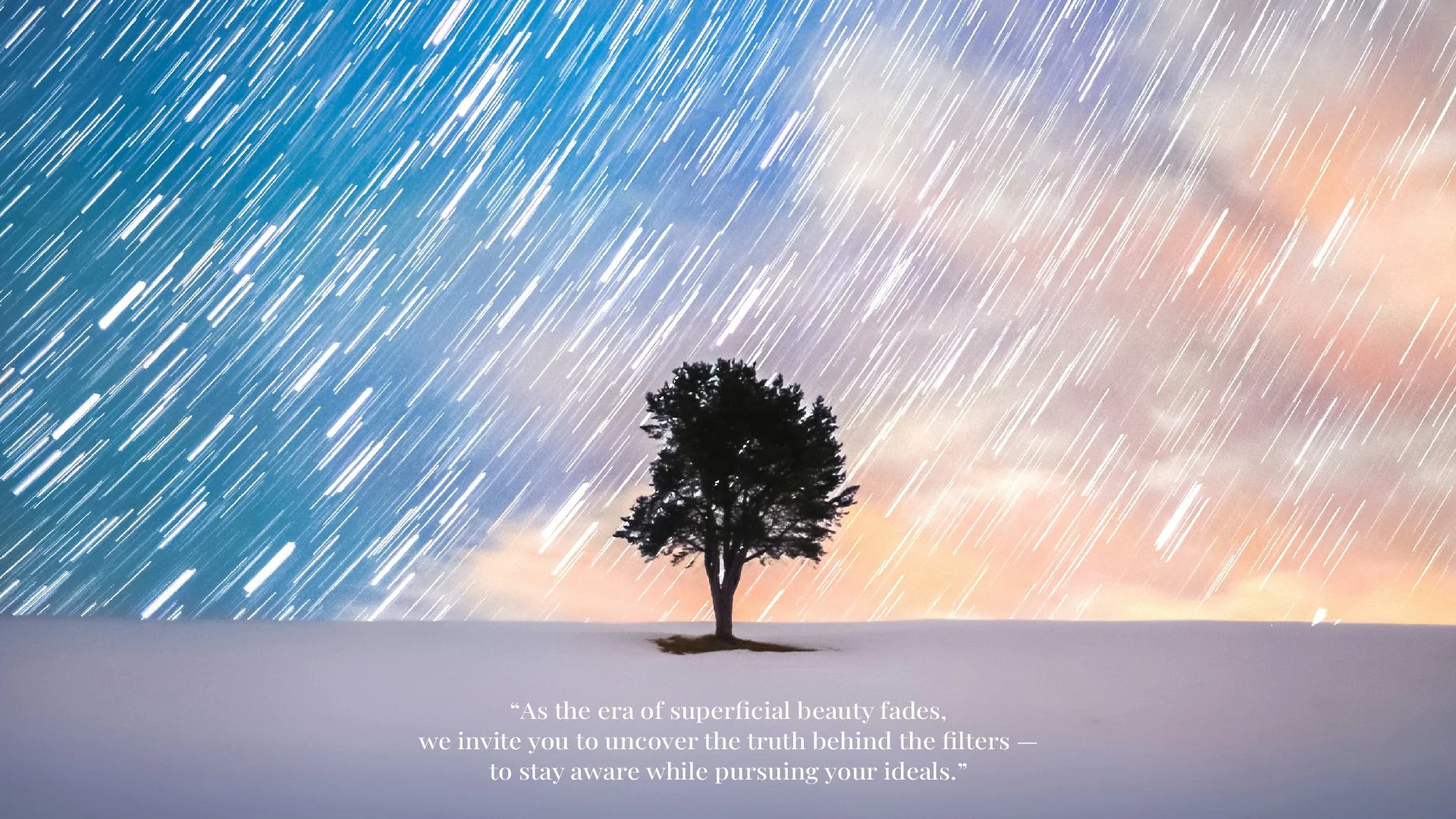
Odreim needed to distinguish itself from traditional “superficial beauty” standards, while also capturing a youthful, dreamy, and fairytale-like aesthetic. Striking the right balance between scientific credibility and a whimsical brand tone became the key design goal.
The Solution
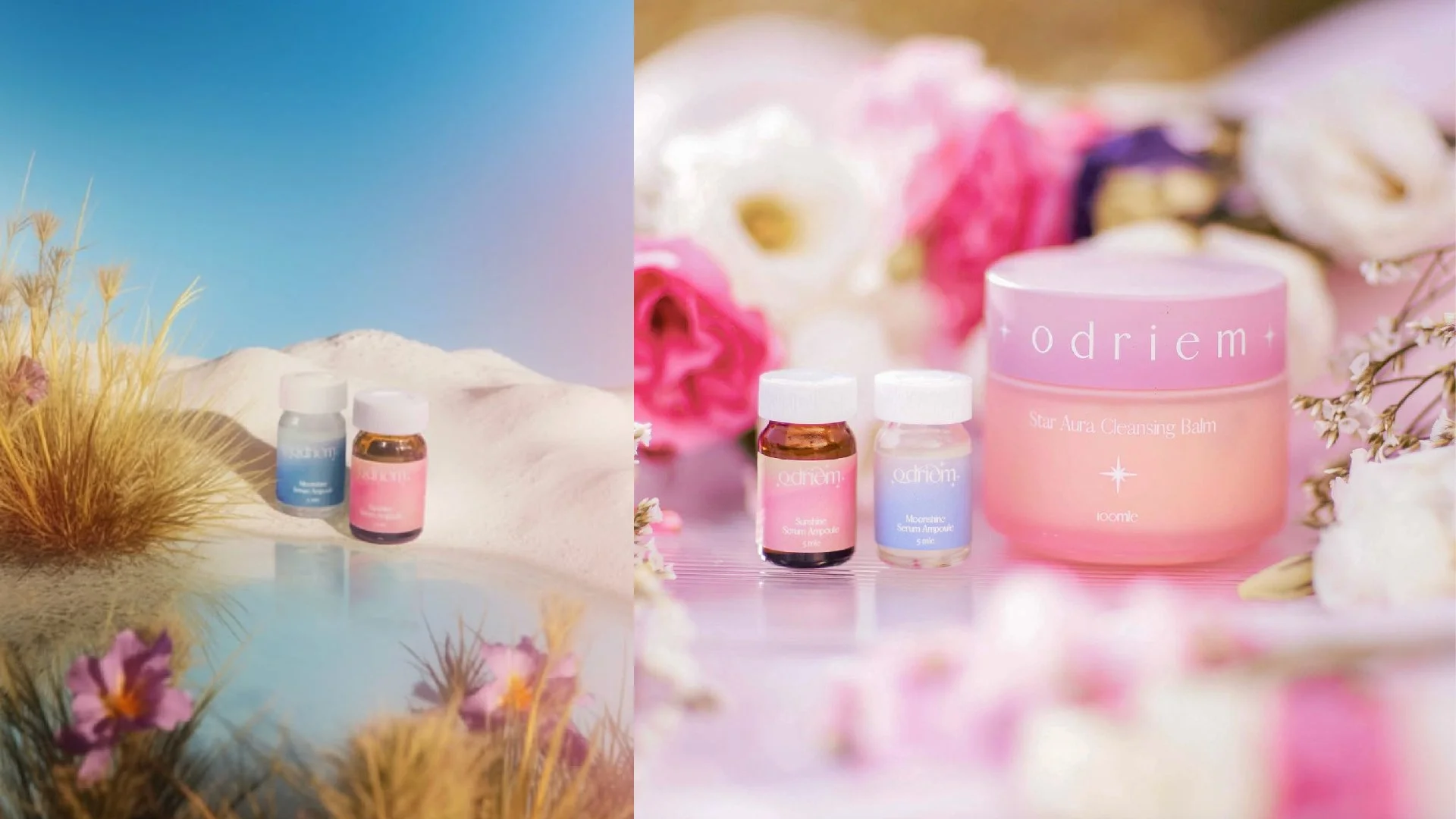
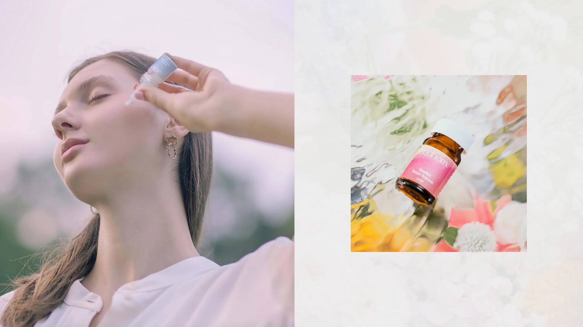
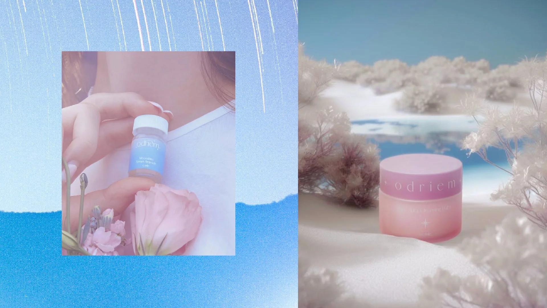
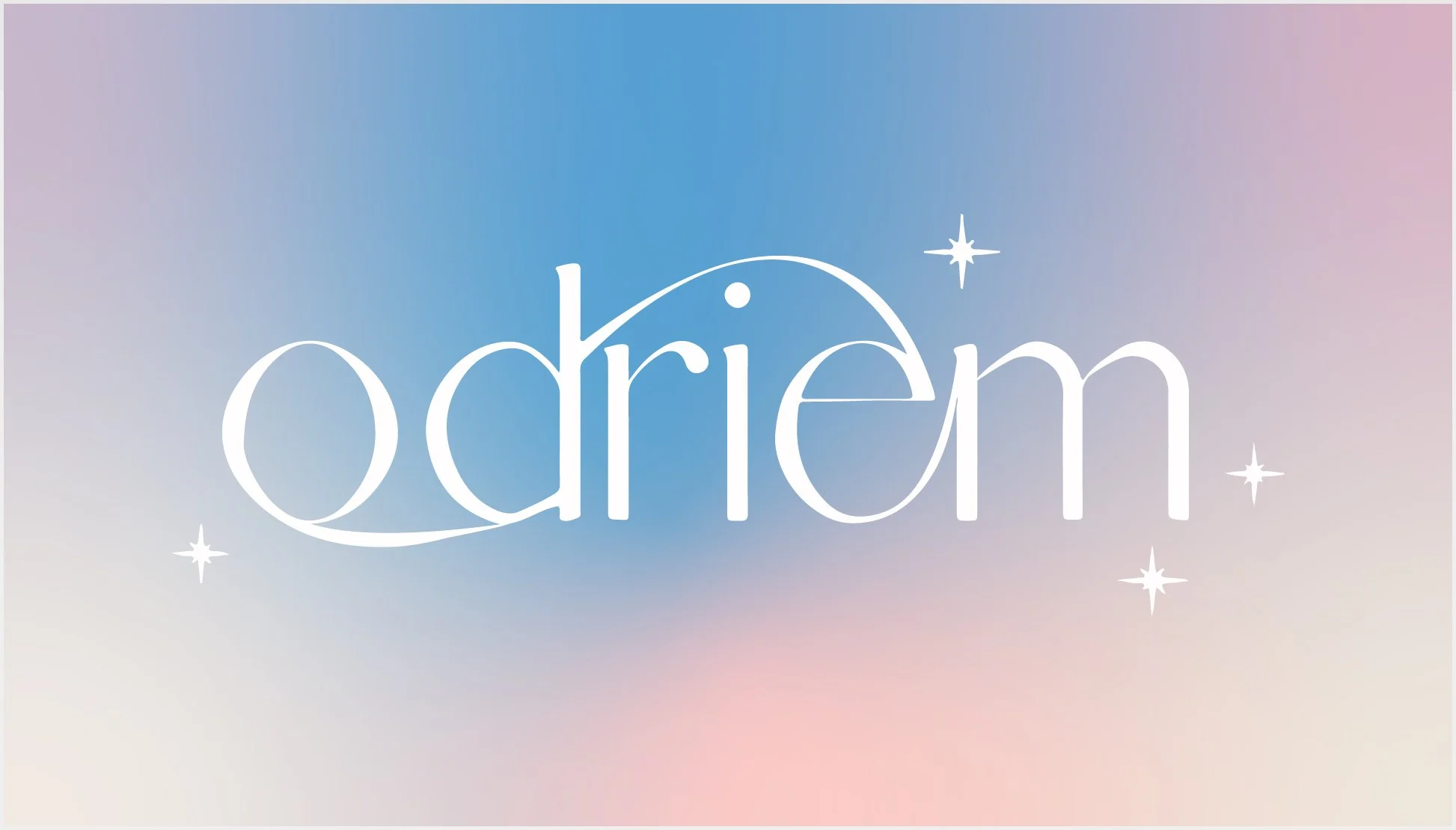
The visual identity started with the logo, built upon an elegant serif typeface to convey sophistication and trust. A starlight motif was then introduced to symbolize youthful energy, fairytale charm, and the idea of rare natural beauty.
The starlight graphic was carefully integrated into the logo to create a subtle shimmering effect, emphasizing delicacy and refinement. Fine lines and soft gradients enhanced the feeling of luminosity and depth.
A pastel color palette was chosen to complement the dreamy and ethereal qualities of the brand. Once the fundamental visual identity was established, the packaging design and photography direction naturally followed, reinforcing Odreim’s balance between authenticity, elegance, and imagination.